
The task of a web designer is to make the site not only look beautiful but make it user-friendly and easy to navigate. In today’s post, you’re going to learn about the secret techniques from professional UX/UI design agencies that help to improve a website’s usability. However, all these tips are rather simple, and with proper practice, even a junior designer can handle them.
Content:
- Remove the extras
- Put basic information on top
- Focus on the F-pattern
- Speed up a website’s load time
- Increase the size of the search box
- Optimize your layout
- Choose fonts and colors wisely
- Integrate links correctly
What is Usability?
Usability is what estimates the website’s commercial success, i.e. conversions, orders, and sales. The concept of usability can also be interpreted as the convenience of performing a target action when a user starts browsing a webpage.
Work with usability is aimed at improving the user’s website experience. Convenience includes all aspects of the site, such as:
- text content
- text formatting
- the presence and logic of the functional elements
- location of functional elements in relation to each other
- the ability to simplify the user’s work with functional elements
- resource design, etc.
Work on assessing the usability of the site should begin when creating the website. The designer should think through every little thing. If the site has been working for a long time but you want to get more value from it, you should conduct a usability analysis.
Top Tips for Making Your Website More Accessible
Use some or all of these tips to design better websites. They can also be used to make your mobile applications more user-friendly.
Remove the Extras
A large amount of unnecessary information will scare users off. By removing the unnecessary information, you will increase the usability of the website and increase the chances that a purchase will be made or a service will be ordered.
How to get rid of the unnecessary details:
- Reduce the amount of optional text. Leave the information that will help the user to decide on their order. Hire a professional copywriter that will create UX copy that converts. Everything else can be eliminated and saved for later.
- Remove the unnecessary questions from the forms. Analyze what client information your company does not need and remove unnecessary elements from the web forms.
- Reduce the number of web forms. Too much content on the page will confuse users.
Put Basic Information on the Top of the Page
Most (about 80%) users primarily read the information on the top of the page. Also, many read information from right to left, then down (the so-called F-pattern). Therefore, place the main message at the top of the page, with an offset to the left.
Follow the F-Pattern
According to this principle, many visitors when first entering the site carefully study the information on horizontal lines, then scroll down vertically. UI design companies recommend placing headers and call-to-actions on horizontal lines, with the navigation bar on the left as a vertical line.
Speed up a Website Load Time
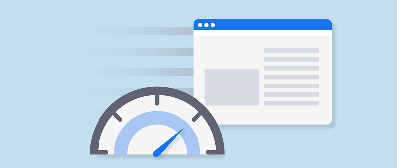
Remove the video, leave less animation. The faster your website loads, the higher the chance that the user will not go to your competitor while waiting. The average patience of online visitors is 2-3 seconds.
Increase the Search Form Size
Increasing the length will accommodate longer search queries. So users will find the information they need. But don’t overdo it: the optimal size is 25-27 pixels.
Optimize Layouts
Use the same layout for most pages on your site. Don’t change the location of well-established elements, otherwise users may get confused when going through the pages. Make sure there are no pages with a 404 error.
Choose Fonts and Colors Wisely
Do not use more than 2-3 colors or 2-3 fonts. Try to choose a palette and typography that is suitable for your target audience while still fitting the aesthetics of your website. Combine serif and sans-serif fonts and use contrast correctly.
Integrate Links Correctly
Follow the classic rules: use blue for links, the color should change during the transition. Also, use an underline.
Make the links as distinguishable as possible from the rest of the text so that the user will immediately understand that they are switching to another website or section.
Final Thoughts
Improving the usability of the website will improve your position in the search results, increase user retention, and attract a larger flow of visitors. The easy-to-use website will gain popularity among users. Thus, you can save a little on advertising and paid promotions.


")