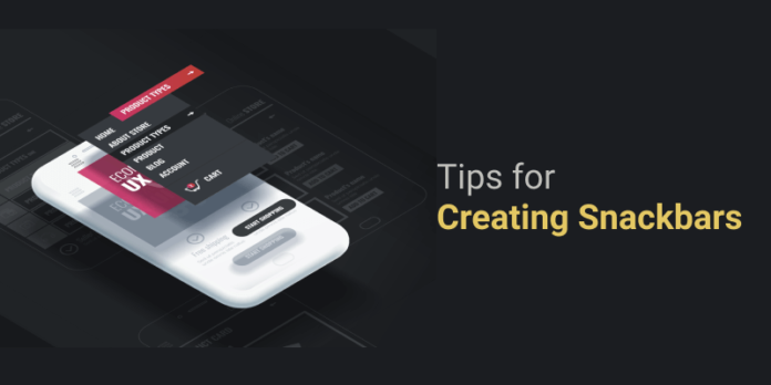
In UX/UI design, a “snackbar” means a user interface element that temporarily appears and contains a single line of text connected with the operation completed. Sometimes it contains a call to action but never icons.
In today’s post, you will learn the key techniques of creating such snackbars that should be taken into account by professional user interface design companies.
The Secret of Creating Perfect Snackbars
Here are the top eight tips to help you design perfect notifications:
Consider the Features of Different Devices
The contents of the snackbar must adapt to all devices. On desktops, a text can consist of one or two sentences, while on mobile devices, it’s better to leave one sentence and set up hyphenation to the next line. It is imperative that the prompt is adjusted to the resolution. You can set the block to 100% width or limit it to a fixed value.
Choose the Perfect Place
On high-resolution monitors, a web design company has room for experimentation. On mobile devices, the usable area is greatly reduced, and Snackbars are traditionally placed at the bottom of the interface.
Set the Appearance Time
Toast messages appear at a certain point, and for a person to read the information and understand the essence of the message, 2-3 seconds are enough. Web analytics and graphic design experts advise showing notifications for at least 4 seconds, but no more than 10. Values that do not fall within this scope may adversely affect the user experience.
The mechanism for the appearance of notifications falls on the shoulders of the programmer. The designer only needs to verify that everything works well on different devices.
Design Perfection
The downside of toast messages is that they are small and appear at the bottom of the interface. Users get acquainted with the content from top to bottom and rarely pay attention to the footer. Owners of older phones often use zoom to view details. They may not notice pop-up blocks at all.
The designer must adapt the snackbar to the visual style of the application or site so that the element does not appear foreign. It is necessary to make the message immediately striking and difficult to miss.
In this matter, Material Design training comes to the rescue. Google’s team has developed great design options: light text on a gray background, rounded corners, and a fixed block width are all ideal traits for this type of design system.
Do Not Spoil the Impression
In some cases, there is a need to show several snack bars almost simultaneously. It is necessary to make their appearance orderly. You can add a little delay or use other solutions.
If two blocks overlap or linger for a long time, users will try to get rid of them or close the interface. It is better to avoid such situations, as it is extremely difficult to get a second chance from users. Negative experiences are imprinted deep in a user’s memory and may emerge at the most inopportune moment.
Use Analogues
Sometimes it’s better to use toast with a close button and other options. For example, if a user sends news for moderation and waits for the verification to complete, you can show a visual notification in the form of a pop-up at the top of the screen.
If users should see constant feedback, snackbars will not work. For example, in the Google Docs cloud editor, automatic saves are implemented after making any changes to the document. But if you show a notification of these saves every time, it will only serve to annoy the users. So in some cases, it is better to choose other options rather than a snackbar.
Conclusion
A designer’s best skill is understanding the users’ intentions. If the specialist knows what the audience wants from a site or application, they will be able to develop an interface that solves problems.
The pace of modern life for people is very high, and projects and brands compete for the attention of their target audience. Any little thing can ruin their impression. So use the available tools wisely and apply snackbars where there is a need to quickly inform the users and give them feedback about their actions.


