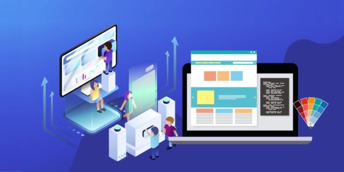
An excellent UX design is crucial in attracting and retaining clients to a website. It plays a vital part in the success of any B2B business. The design thus needs to be impactful, inspiring, and accessible.
Apart from helping visitors find what they need quickly, it also positively reflects your brand. If not yet, you should consider hiring a professional web development company to help you with UX design for your B2B website.
You need a hand to help you create a website that attracts users, optimizes lead generation, and maximizes conversions.
What Is UX Design?
User experience (UX) design is the process design teams use to create products that provide high-quality experiences to users. The process involves the design and the integration of the products including branding, usability, and function.
User experience design also focuses on improving the product to enhance the users’ experience. It does this by implementing various techniques like usability, human-computer interaction, visual design, and information architecture.
The concept here is to improve customer satisfaction and loyalty through ease of use.
What is B2B?
B2B is a business model where one company provides products or services aimed at other companies’ business activities. The target audience for these businesses is other businesses and not individuals.
The nature of these relations impacts the business process, promotions, and strategies involved. Their interactions are crucial elements to excellent and user-friendly design solutions. The type of business always defines the type of your audience.
B2B websites need to explain a lot of things to get buyers to convert. These websites act as a validation that a business is legitimate. They also deliver relevant content to diverse audiences with target organizations in mind.
How Does a B2B Website and B2C Website Differ?
While B2B is a business model that focuses on business to business, B2C focuses on business to consumer. Since the nature of their businesses varies, their websites also vary.
One major difference between these websites is the nature of their audience. B2C websites target individual personas. The design teams put a lot of effort into personalizing the website based on their customers’ purchasing and browsing habits.
B2B websites, however, target audience groups. Thus, the information architecture of the websites can be complicated as it’s trying to address different pain points to suit different personas in an audience.
Nevertheless, whether it’s a B2B or B2C website, it’s important to put user experience first. One way to achieve this is through VPS hosting. VPS uses virtualization technology to offer you private (dedicated) resources on a server with multiple users.
It allows you to scale your site effortlessly when you need more resources. Some of the recommended VPS include Contabo, Vultr, and Digitalocean.
Things to Consider When Designing UX Design for B2B Websites
The website design should be aimed to strengthen the brand and the company’s policy. Here are some things to keep in mind when it comes to UX designs for B2B websites.
Design for Your Customer Persona
You have to know who your business is targeting. Individuals are skeptical when purchasing services or products for their businesses. People want to get value for their money, to end up with an impressive ROI.
You have to convince your customers of the following aspects.
- Your product or service is of the highest quality.
- Investing in your product or service would benefit them and their customers.
- Guarantee them constant support after the investment
After designing your buyer persona, you’ll create marketing that convincingly provides all this information.
Apart from catering for the existing customers, it shouldn’t neglect the secondary audiences. These include prospective new hires, potential new hires, and the media.
Content Plays a Huge Role in Proper UX Design
Don’t overwhelm your consumer with information. Thus, it’s essential to prioritize your content. You might be tempted to showcase all parts of your stronghold. Unfortunately, this may lead to information overload, thus confusing your audience in the process.
Most visitors want an easy time when scanning your website. You need to apply layout and design techniques to strengthen the visual performance of the core information.
The copy blocks also need to be easily digestible. Both long and short copies may work at this particular stage. It all depends on the message you want to pass around and the research on how it directly influences the conversions.
For instance, if it’s information or a favorite company product or service, a concise message would be enough to entice the users to take action.
However, if you are introducing a new product or service, it’s necessary to provide them with more information to persuade them to take the necessary action.
The copy content needs to be in short paragraphs to give your audience easy scanning through it.
Allow Users Control and Freedom
Get rid of anything that takes the control out of your user’s hand. Users often click unwanted pages. Thus, they’ll want to click exit immediately, without going through long processes, which might frustrate them.
Some of the instances that may take power away from the users include:
Autoplay Videos
Autoplay videos can be a nuisance to users, worse still if the default sound is on. Don’t assume that your site users would want to play the video. Let them decide for themselves. After all, videos should supplement texts.
Automatic Carousels
Automatic slide banners only frustrate and cause anxiety to users. Rather than using this technique, layer information to encourage users to have complete power over their experience.
One of the ways to achieve this is using tabs to guide the users through related content.
Pop-up offers
Visiting a website where a pop-up window appears telling you to subscribe or take a survey is common. Nevertheless, these intrusive pop-ups could be annoying. Always give the users the power to reject the pop-ups offered.
Your System Status Need to be Visible
The goal here is to ensure a user gets an easy time navigating your B2B website. You need to tell your buyers where they are every time they are navigating your site. You can achieve this through:
- Breadcrumb navigation
- Highlighting selected menu options
- Showing progress bars
- Incorporating thank you pages
Your CTA’s elements also need to be seen. Otherwise, you might lose potential clients because of this.
Your visitors are busy people who aren’t likely to spend a lot of time looking for a button. Thus, you may want to apply shape, color, or orientation contrast. It may not matter a lot to you now, but it has a crucial effect on the conversion rates.
Wrap Up
A user relationship with products is a continuously evolving process. Thus, UX design strives to improve the effectiveness of that interaction. Even with the technical aspects in mind, it’s essential to acknowledge that you are dealing with people, hence important to showcase that.
Remember, your customers expect from your ease of use, high-quality services, and exceptional value. This is the ultimate goal of a B2B UX design.


